投放本站广告请联系:
extjscn#126.com
广告合作
Sencha相关书籍
- 中文书籍:
- 英文书籍:
导航
聚合

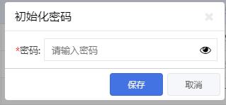
Password控件 显示密码切换
现在的密码越来越复杂,为了保证输入正确,很多地方需要显示用户输入的密码来核对
效果如图:
扩展源代码:
//扩展
//密码按钮扩展
//支持在密码与非密码之间切换
Ext.define('ux.form.field.Password', {
    extend: 'Ext.form.field.Text',
    xtype: 'passFile',
    requires: ['Ext.form.trigger.Component'],
    //禁止自动填充
    autoComplete: 'off',
    inputType: 'password',
    //自定义样式
    cls: 'password',
    triggers: {
        cutoverButton: {
            type: 'component',
            //只读时隐藏,此功能未测试
            hideOnReadOnly: true,
            preventMouseDown: false
        }
    },
    /**
 * @private 创建切换按钮
 */
    applyTriggers: function(triggers) {
        var me = this,
        triggerCfg = triggers.cutoverButton;
        //增加切换按钮
        if (triggerCfg) {
            triggerCfg.component = Ext.apply({
                xtype: 'button',
                ownerCt: me,
                //加入小图标
                iconCls: 'x-fa fa-eye',
                id: me.id + '-triggerButton',
                ui: me.ui,
                listeners: {
                    scope: me,
                    click: me.onCutoverClick
                }
            });
            return me.callParent([triggers]);
        }
            // <debug>
        else {
            Ext.raise(me.$className + ' requires a valid trigger config containing "button" specification');
        }
        // </debug>
    },
    onCutoverClick: function(t) {
        var type = 'password',
        iconCls = 'x-fa fa-eye';
        if (!t.isText) {
            type = 'text';
            iconCls = 'x-fa fa-lock';
        }
        t.isText = !t.isText;
        //切换图标
        t.setIconCls(iconCls);
        //切换输入框类型
        this.inputType = type;
        this.inputEl.dom.type = type;
    }
});
样式:
/*#region 自定义密码控件*/
.password {
    .x-form-trigger {

        .x-btn-default-small {
            border: 0;
            background: none !important;

            .x-btn-icon-el-default-small {
                color: black;
            }
        }
    }
}
/*#endregion*/
作者:魔狼再世
原文:http://www.cnblogs.com/mlzs/p/7509004.html
- 关键字:
- 显示密码,
- 中文教程,
- Password控件,
- ExtJs
- 要发表评论,请先登录